macOS 11 Big Sur changed Spotlight to bring it more in line with iPadOS search. These changes are intended to simplify things, but they create inconsistencies that may be confusing both to newcomers and to long-time users.
Ultimately, there are three interconnected changes: hidden previews, disclosure indicators, and suggestions. This post will analyze the changes and provide recommendations to help frustrated users.
Of course, I believe that Lacona is an alternative to Spotlight that is both more usable and more powerful, but I won’t be making comparisons to Lacona in this analysis.
Hidden Previews
Just as before, you call up Spotlight by pressing ⌘+Space, or by clicking the magnifying glass icon in the menu bar. However, things change once you start typing.
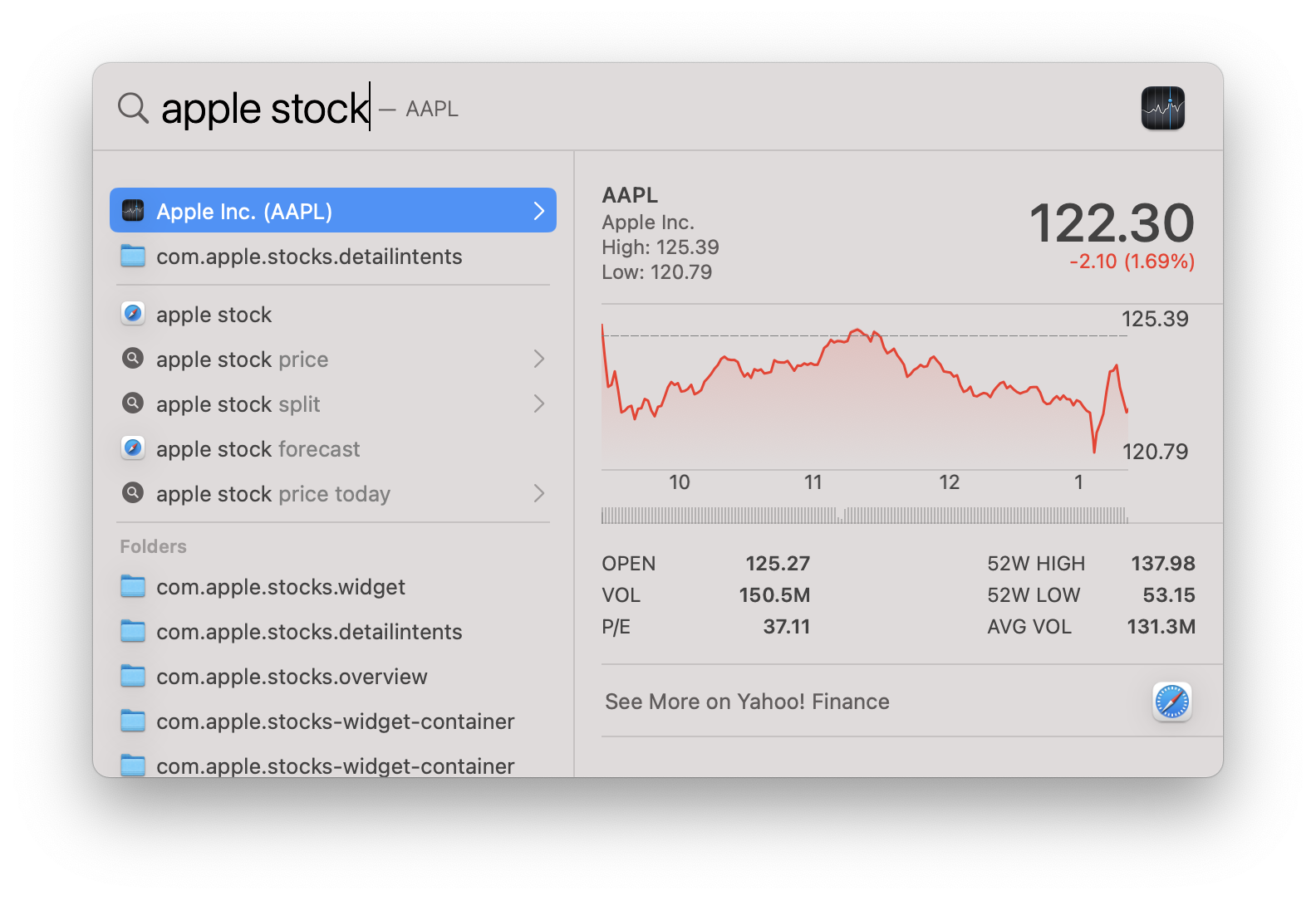
In macOS X, Spotlight showed your search results in a list on the left side, with a preview on the right side. In Big Sur, the search results are presented in a single list, with no visible preview.
These previews—which were originally introduced as a headlining feature of macOS 10.10 Yosemite—are not actually gone, just hidden. Clicking on a result, or pressing Tab will show the preview.
It’s clear that hiding the preview is an attempt to make the interface appear simpler and more iOS-like. Indeed, it frees up space; but the new space isn’t actually used for anything. For most queries, this space is left completely empty. What’s worse, this whitespace visually separates the results from the crucial new interface element on the far right side, the disclosure indicator.
Disclosure Indicators
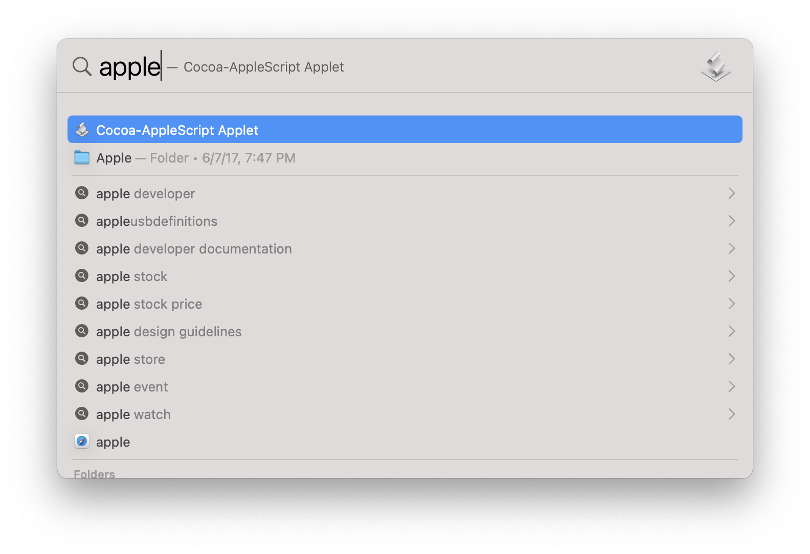
Some results have a small iOS-style arrow on the far right side. Apple refers to this arrow as a disclosure indicator. It indicates that pressing Return on this result will not open anything, but will instead display the preview on the right side of the window.
Once the preview is displayed, pressing Return again will open the result, even though the disclosure indicator is still present.
These results can be very useful! However, for the first time in Spotlight’s history, ambiguity is introduced to the Return key. Some may consider this necessary complexity, but it’s not the last inconsistency we’ll see today.
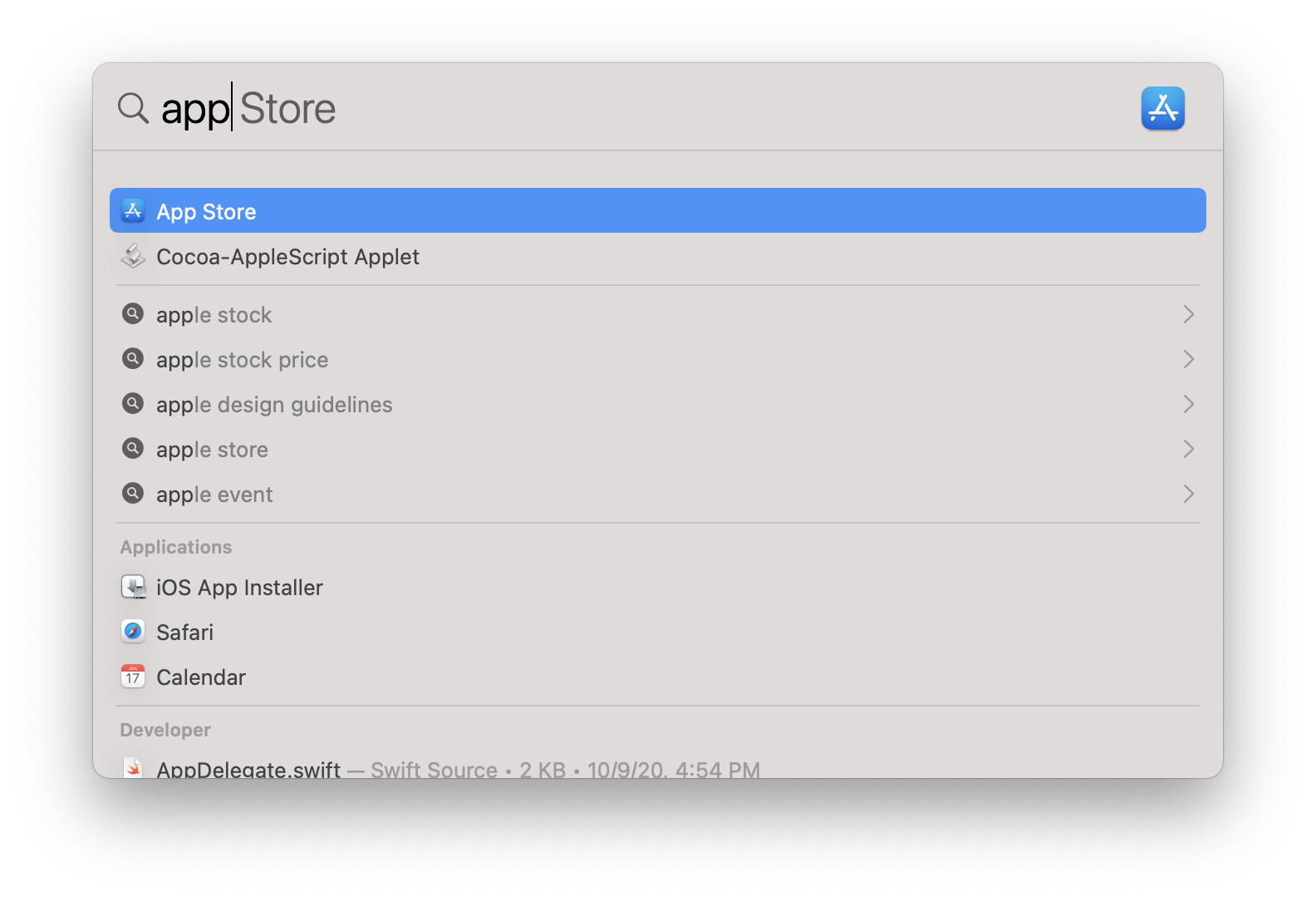
Suggestions
In addition to showing search results, Spotlight now has an additional unlabeled section which I call suggestions. Directly below the unlabeled “top results” section for any given search, there is a section containing a handful of queries that Spotlight believes you may be typing. Some of these queries show the icon of your default web browser, and others show a Spotlight icon and have a disclosure indicator. The number and order of these results varies, but they could take up as much as 83% of the results “above the fold”.
These suggestions are based on both “Siri Suggestions” and the files of your Mac. This behavior is interesting, but I can’t say it’s very useful; the files referenced always show up further down on the list.
When selecting one of the results with the web browser icon, Spotlight will search for the query using your default web search engine in your default browser.
When selecting one of the results with the Spotlight icon, your input query will change to the suggestion, and the preview will also be shown.
The Problem with Suggestions
The most important inconsistencies with these suggestions come when using the mouse. Since the inception of OSX, clicking has meant select. Single-click a file in Finder or a track in Music, and it will be selected. This is how Spotlight used to work, and all non-suggestion results in Spotlight still work this way.
However, for suggestion results, clicking will activate them immediately. This, you may notice, is the way things work on iPadOS. Not only is this inconsistent with macOS in general, it is inconsistent with other results on the very same list. Worse still, because the suggestions section is unlabeled, it becomes harder to figure out exactly what clicking on a result will do.
Even with the keyboard, these suggestions behave completely differently from all other results. I originally tried to write out all different cases, but the inconsistencies are too numerous to list with text. I’ve attached an appendix enumerating all the cases.
Overall, the suggestions section is Spotlight’s biggest step backward in usability. Its behavior is inconsistent and confusing, it takes up huge portions of the most important result space, and its utility is situational at best. Worst of all, this is the only section which cannot be fully disabled in the Spotlight preferences. You’re stuck with it.
Recommendations
To make your search experience better, here are some recommendations:
- Expand the window by dragging from the bottom, so that more results can be displayed.
- Ignore the “suggestions” section and its inconsistent behavior.
- Consider disabling “Siri Suggestions” in the Spotlight preferences, which removes many (but not all) of the suggestions.
- Don’t rely on the mouse for selecting items. Use the
⌘+Downand⌘+Upshortcuts to quickly move the selection between entire sections with the keyboard. - Press
Tabwhenever you want to see a Preview of the results. - Consider using a Spotlight alternative with a more considered design.
Conclusion
Spotlight in macOS 11 Big Sur is torn between two between different worlds.
In one dimension, it introduced iOS ideas like disclosure indicators and single-tap actions for its new features. However, it only went half way, leading to an inconsistent and unpredictable experience.
In another dimension, it is trying to introduce AI-powered suggestions to make Spotlight more proactive and Siri-like. However, these suggestions are too constrained by the existing Spotlight interface to be very useful, and take up valuable space that could be used for the more reliable features.
In future releases, I hope that Apple can push Spotlight fully into simplified iOS paradigm, or retreat to the power of macOS. In macOS 11 Big Sur, it tries to straddle the line and fails at both.
Appendix: Behavior Changes
Spotlight Behavior in macOS 10.15 Catalina (and Prior)
| Return | Click | Double Click | ⌘+Return | |
|---|---|---|---|---|
| File Result | Open | Select | Open | Show in Finder |
| Other Result | Open | Select | Open | Open |
Spotlight Behavior in macOS 11 Big Sur
| Return | Tab | Click (Selected) | Click (Unselected) | Double Click | ⌘+Return | |
|---|---|---|---|---|---|---|
| File Result | Open | Show preview | Open | Select and show preview | Open | Show in Finder |
| Web Result | Open | Show preview | Open | Select and show preview | Open | Show preview |
| Result with disclosure indicator | Show preview | Show preview | Show preview | Select and show preview | Open | None |
| Previewed result with disclosure indicator | Open | None | Open | Select | Open | None |
| Spotlight Completion | Modify input | Select input | Modify input | Modify input | Modify input | None |
| Browser Completion | Open | Select input | Open | Open | Open | None |
| Other Result | Open | Show preview | Open | Select and show preview | Open | Open |